Preparing a pitch - things found on t'internet

31 Jan 2010

For the past few months, we at Slurpy have been working hard to prepare a pitch for a BBC children's series. Obviously I can't say much about the series, only that it's aimed at the Cbeebies (very young) audience and that we're very excited about it. What I did want to share with you though, is all of the useful things that I've found on the internet while I've been researching this project, which I think any young studio or even independent animator will find useful. There's not always a huge amount of information available with regards to budgeting and planning a series, so here's some of what we've found useful...

Animation Production Process

Dave Redl, creator of the Family Pants series, has written an incredibly useful and informative essay on the Animation Production Process from beginning to end. It's geared towards people using Flash, but is an excellent general introduction.

"Imagine getting the script, "Fred gets a bowling ball from the closet.” A directors can kill a budget with a simple action like this. They'd show Fred opening a closet toward us, stepping out of the way to reveal 1,000 gags in the closet; a pterodactyl umbrella and such, then grab the bowling ball on the top shelf causing every one of the 1,000 items tumbling out toward us, in perspective, and finally having the bowling ball hit Fred in the head. A simple act, that might be funny, but has nothing to do with the story other than getting the ball.

Hanna and Barbara would have simplified this to; Fred walking left, asking Wilma, “Where’s my bowling ball?” Cut to Wilma sitting in chair, we only see her neck up, “In the closet Fred.” We hear a door opening off camera. Cut to Fred’s butt sticking out from behind a closet door with some rummaging sounds. “I can’t find it! There’s too much stuff in here!” Cut back to Wilma, “Try the top shelf dear… Fred look out!” A crash off screen, the camera shakes and Wilma’s eyes close. Cut back to a pile of stuff in front of a damaged closet door. Fred’s head pops up from the wreckage, “Wilma, one of these days, you have got to clean out this closet!” Then the bowling ball rolls off the top shelf onto his head with a “klunk!”

Dave also shows his animatic as an example, and offers to send the .fla to anyone who emails him. (Also, check out the Family Pants cartoons if you haven't seen them, they're very funny).

Animation Budgets for films, TV shows, shorts and DVDs

Researching budgets can be one of the most difficult parts of preparing a pitch. Going too high or too low can be disastrous, and without having made a series before, it can be difficult to know where to begin. Captain Capitalism doesn't answer this question for you (I'm afraid it's some pretty complicated maths mostly), but he does offer this fascinating graph which shows the budgets of animation films and cartoons throughout history, all adjusted for inflation.

Did you know, for example, that Steamboat Willie cost the equivalent of $173,886 to make (which in 1928 was $15,000) and was 7 minutes long, working out at $414 per second of screentime, or $23 a frame? Whereas Treasure Planet (which I believe comes second only to Final Fantasy in biggest animated financial disasters) cost $159,434,929 to make, working out at $1,553 PER FRAME!

Well worth checking out: http://captaincapitalism.com/blog/2008/11/animation-budget-history.html

Animation Budgeting Spreadsheet

This incredibly useful (and really quite daunting) budgeting guideline from Screen Australia is easily the most useful document I've found on the web. It breaks down every part of the production process in to possible expenses and contains all of the formula that means you're not going to spend your days poking at a pocket calculator. Under 'Publicity materials' for example, the list of options is:

  • Publicist
    • Fees
  • Stills
    • Stills Cameraperson
    • Graphic Design and Photo Manuipulation
  • Press Kits
    • EPK - see d.below
    • Cover
    • Typing
    • Artwork
    • Printing
    • Distribution
    • Copies of DVD Trailer/Clip
  • Electronic Press Kit
    • Production
    • Copies
    • Distribution
  • Promotional Materials
    • Graphic Design
    • Printing
    • Fliers
    • Postcards
    • Poster
    • Distribution Boxes, Tubes for posters
    • Other
  • Video Promo/Clip Selection
    • Production
    • Dubs
    • Distribution
    • Boxes, Labels, etc
  • Website Production
    • Domain Name Fees
    • Hosting Fees
  • Other
    • Crew/Cast T-shirts
    • Other

Now, would you have thought of allocating money for Crew t-shirts? Me neither! Thank you Screen Australia!!!

The Pitching Process

A lot of excellent articles have been written on the nerve-wracking process of pitching to a networking, here are a few... Screenwriters Daily - how to pitch a cartoon AWN - a perfect pitch Media Freaks - Cartoon series pitching Q&A And of course there are lots of locations where you can pitch to multiple networks at one time, such as; Kidscreen Summit, Cartoon forum, MIPCOM, and MIPTV

Commissioning briefs

Every network will have different commissioning briefs, because each of them has a different remit. Cbbc and Cbeebies both offer up their commissioning guides as .pdfs from their websites. CBBC and CBeebies. These documents give great insight in to what the different channels are looking for (basically the next Charlie and Lola), and what their intended budget is.

Other useful things

Everyone is used to using Stock Photography these days, but what about Stock Music and Sound Effects? For smaller budget productions these can be incredibly useful and save a huge amount of money. We use Audio Micro for choice, because their search engine works better than the others we've experienced, which allows us to save time.

As someone who's spent ridiculous proportions of their life contorting their body in the mirror so they can draw different positions, this photo reference library is incredibly useful. I've only just discovered it, but I can already tell I'm going to be going back there most days!

Avatar

26 Jan 2010

For the past month we've been allowing the hype surrounding Avatar build to a crescendo that was practically deafening us, and last night, finally, we succumbed.

We put it off because we really wanted to see it in Imax, but never found ourselves anywhere near one with any spare time. It's embarrassing enough for anyone involved in film and animation to have to admit that they haven't seen the film that the person they're in conversation is raving about ("oh my god, you haven't seen [enter completely obscure and probably Japanese film that no one really understands or particularly enjoys] - but I thought you were in to animation!"). It became clear quite early on that missing Avatar in the cinemas was going to cause a huge amount of future embarrassment for generations to come. So, in the name of research and to protect any potential offspring, we trundled off to the local cinema.

And we loved it. Of course we did. Everyone loved it, today it celebrated becoming the highest grossing film of all time, overtaking Director James Cameron's last film Titanic which took something absurd like $1.8billion. I like to think that our fairly extortionate ticket prices (£12.50!?!?!?) contributed to that record.

"Fox have confirmed that Avatar overtook Titanic on Monday to become the highest earner at the worldwide box office. Total global receipts have reached $1,858,866,889, $16 million ahead of the $1,842,879,955 earned by Titanic in 1997/98. Purists will point, of course, to the effects of inflation and increased ticket prices thanks to IMAX and digital 3D screenings. But Avatar hasn't finished yet. Next up will be Titanic $600 million domestic record, and $2 billion worldwide. More milestones beckon beyond that... at its current rate, Avatar has a shot at topping $750 million at the US box office and $2.5 billion worldwide. James Cameron has been vindicated again."
Numbers.com

(It should perhaps be noted that these numbers have not been adjusted for inflation, and neither has it been taken in to account that most people see Avatar in 3D and therefore pay more for their tickets. The announcement that Avatar overtook Titanic could infact be seen as another trick in the most impressive PR campaign that the world has seen since Obama's election campaign.)

It's an absolutely staggering film. The CG elements are introduced so subtly that Cameron takes you from reality to fantasy without you even noticing. Soon you're having the same emotional and intellectual responses to characters who are nothing more than pixels, that you were with the flesh and blood characters that share the screen. It's the sign of a good storyteller - one who can make you loose yourself so completely in the story that you barely notice that you've strayed a long way from the straight path of reality, but keep you feeling the emotions that you associate with real, living and breathing characters. James Cameron, director of Titanic, Aliens and Terminator 2, is nothing if not a great storyteller.

However, a huge amount of credit has to go to the special effects and animation teams of WETA and ILM. Most people know the story that James Cameron knew that technology had finally caught up with his vision for the film when he saw WETA's character Gollum in Lord of the Rings, and it will be the ground breaking effects for which this film will be remembered. Cameron described it as a 'game changer' and as an animator I can imagine that a whole lot of the CGI studios are going to be looking to raise their game. With a budget of $280 million and an estimated time of 47 man hours per frame of animation (and there are 24 frames per second of film for the uninitiated), studios are going to have to take a big gulp and dig deep if they want to even consider competing with Avatar.

Avatar is far from an original story. Infact it's Pocahontas. (Disney's Pocahontas that is, not the real story where she was a child of 10). Here's a plot spoiler that reveals some pretty compromising similarities. Change the odd name and skin colour and you've got yourself a pretty identical movie - talking tree and all!


This doesn't really bother me. I like Pocahontas and I like Avatar - one of my old University lectures once said that there is only one original story and everything else is a knockoff. Incase you're wondering, it's "a stranger comes to town..."

(Of course it's the ... that's the important bit.)

I'm not as loved up as some of the people in this really quite hilarious article who are quoted as saying


"
It's so hard I can't force myself to think that it's just a movie, and to get over it, that living like the Na'vi will never happen"

and "When I woke up this morning after watching Avatar for the first time yesterday, the world seemed ... gray. It was like my whole life, everything I've done and worked for, lost its meaning," .

(This curious side effect of the movie even has a name; 'Post Avatar Depression'

I loved the time I spent in the cinema watching Avatar, loved the world and the people and the message. If it's made even the slightest change in our attitudes to our wanton destruction of the Earth's natural resources then I am over the moon, but mostly I just enjoyed the film. I think you'd have to be pretty determined not to enjoy it to come out of it with any other conclusion.

The Simpsons celebrates 20 years, and Slurpy talk to BBC radio about the reasons behind their success

18 Jan 2010


In January 1990, The Simpsons left their slot on the Tracy Ullman show and began the first series of what was to become a global phenomenon. Homer, Marge, Bart, Lisa, Maggie and friends have starred in 450 episodes of the show, making it the longest running American sitcom ever AND the longest running American entertainment show, going over 21 series and spawning a movie that made $527 million at the box office, not to mention the merchandise which was reckoned to be worth $750 million in 2008 alone.

The show helped change the perception of animation being only for kids, and paved the way for South Park, Family Guy, King of The Hill and Futurama and all of your other favourite animation shows. Seth McFarlane, creative genius behind Family Guy has said "The Simpsons created an audience for Prime Time animation."

Fascinating Fact: On September 11 2001, Seth McFarlane was supposed to be aboard the plane that flew in to the World Trade Center and killed everyone on board. It was only due to a mix up with his travel agent that Seth missed his flight and was able to give the world Family Guy.

From the very beginning, the show has been multi-generational; enjoyed as much by children who can giggle at Bart's 'eat my shorts' attitude as by adults who can relate to the lazy but good hearted Homer or the long suffering Marge. These are real people, with real issues and real feelings (infact they're creator Matt Groening's real family apparently, he named all of his most famous characters after his own family except Bart!). The Simpsons all have their faults, but they're also a strong family unit who look out for one another and always end up making the right decisions. This is a show that adults can enjoy alongside their young ones, laughing often in completely different places as one set of jokes goes over the first generation's head and tickles the funny bone of the next. This is something we're seeing more and more of in animated films at the moment as Producers try to widen the appeal (and therefore the profitability) of their films - Shrek is a wonderful example of this (the first one is anyway - the only thing that the latter two are wonderful examples of is corporate greed and style over substance in my humble opinion).

BBC Radio Surrey and Sussex (formerly BBC Radio Southern Counties) rang us up on Thursday to ask us our opinion on why The Simpsons has gone the distance and to help them celebrate 20 years of yellow mania. The interview is below.

(It should probably be mentioned that I was quite nervous and somehow managed to say South Park instead of the Simpsons in answer to the very first question! Not a great first answer on National Radio, but the interviewer Danny Pike managed to maintain a very professional attitude and not mention it. Unfortunately my friends and colleagues all did!)


Enjoy!

Slurpy Receives Honors from American Design Awards

11 Jan 2010

Slurpy are pleased and proud to announce today that we have received an award from the American Design Awards for the design of its Retro Tuckshop website. Our entry was among 25 sites chosen from a pool of over 2,000 entries.

This award is a great tribute to our hard work, dedication and creativity, especially since it comes from fellow design professionals at American Design Awards. This concludes a wonderful year for Slurpy, after our Music Video 'The Best Day We Ever Had' toured the world's animation festivals, and our multi award winning short film 'Death by Scrabble' continued to garner praise and recognition.

We would also like to give our thanks to Kate Henning, the owner of the website for giving us so much freedom with the design, (and also for the large quantities of sweets which she gave us as a thank you present - my dentist may not appreciate them, but I certainly did!). Retro Tuckshop is a great business, and the perfect place to order your sherbet fountains, fizzy whips and aniseed balls. We're very happy to have been able to give Kate a great design and vastly improved visitor numbers through our search engine optimization work.

The American Design Awards looks at and grades hundreds of web design entries each month in their Monthly Design Contest. Grading is based on creativity (40 points), effectiveness (30 points), and practicality (30 points), for a total of 100 points. Slurpy scored a total of 73 points, winning ourselves a very shiny glass plaque.


Top 10 Photoshop fails

5 Jan 2010

I've spent a lot of time in Photoshop over the last few weeks, manipulating photos and making people look thinner and more plastic. It can be quite obsessive work, so I thought I'd emerge to share this post with you. My friends are always asking me to 'shop them in their holiday snaps etc, and I've slowly noticed that the general consensus is that Photoshop can achieve absolutely anything, and that it's a simple matter of opening an image in Photoshop and clicking a few buttons for the person in it to resemble Sharon Stone.

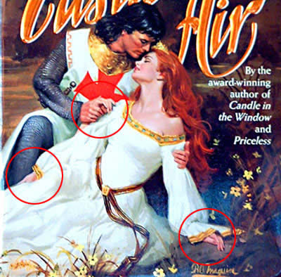
It's true that Photoshop is a phenomenally powerful program, and that pretty much anything can be achieved in it with sufficient time and skill. This photo shows how the program is frequently used and abused by journalists desperate for a story when there is none.


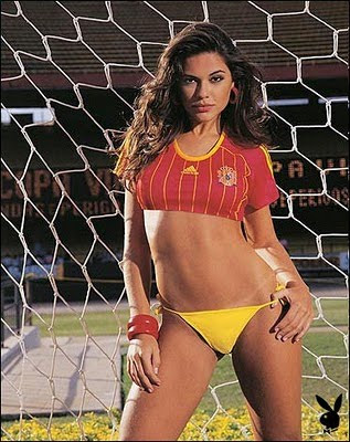
However, for anyone who still thinks that making someone go from 20 stone to the cover of Playboy is done with just a couple of mouse clicks, I thought I'd show some of my favourite Photoshop disasters. These are all available elsewhere on the web, and undoubtedly the work of highly proficient Photoshop users who simply found themselves up against a tight deadline or an unreasonable Client.


Top 10 Photoshop fails:

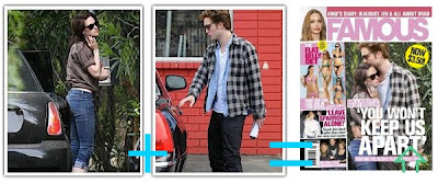
One of the most famous Photoshop mistakes, and quite definitely the result of a heavy drinking session the night before. Pretty hard to miss!


A miracle cereal that helps you lose weight and turns you white!!!


I'm betting that someone got fired for this one - how do you not notice when you chop off someone's head?


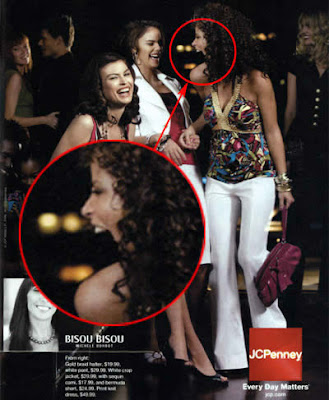
Either someone forgot to put this woman's jaw back, or she is about to devour her friend in one bite


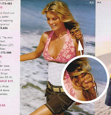
This Photoshopper obviously just enjoys doing hands, or he got a bit confused by the dress!


Very sexy and everything, but is she perhaps missing something? ...maybe like a belly button?

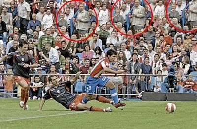
The clone tool is a wonderful invention, but should perhaps have been used a little more sparingly by this particular Photoshopper.

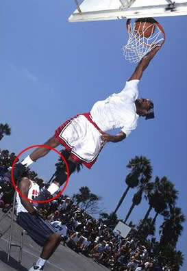
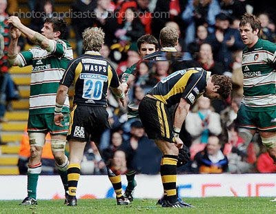
Another classic from the world of sport. My guess is that the designer planned to finish this job later, but never quite got around to it!

Either that arm does not belong to that man, or that man does not belong to that arm! ...Or possibly he just has one massive arm that he waxes regularly.

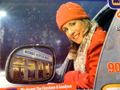
There is just too much wrong with this image to even begin to make sarcastic comments. I'll start you off with
- The wing mirror is MASSIVE
- What angle of reflection is that??
- The text is the right way around
and let you go from there.

Let that be a lesson to all of us to double check our work before it goes to the printers! Probably time for me to get stuck in to my work again... I've a feeling I cut a head off a basketball player earlier that I should probably stick back on!


PS. The original source for many of these images is Photoshop Disasters, which is well worth the occasional perusal at your leisure.

Disney's Rapunzel - concept art

2 Jan 2010

Rumours about Rapunzel have been circling the internet for many years now, and slowly the excitement inside me has been growing to a fever pitch that now threatens to explode at the merest mention of the film.

Why am I so excited? Because Glen Keane; THE Glen Keane, the master animator responsible for Aladdin, Tarzan, Ariel, and above all the Beast, is directing. If that's not enough to transform any self respecting animator in to a puddle of excitement then frankly I don't know what is.

Glen Keane has always been my favourite animator. Even when I had no idea that the same guy animated so many of my favourite characters, they still stood above the rest as examples of perfect characterization and life. It's Tarzan and the Beast that particularly impress - watch the way they move, so powerful, so controlled and so perfectly fitting their personalities and histories. They aren't particularly vocal characters either, so all of their emotion and storytelling had to come from the animation.

"Tarzan is defined by how he moves, more than how he speaks. It's like Bambi. There are scenes in Bambi where there is no dialog. There's just a deer moving. And it stops. It's ears move. It turns. It's fascinating watching the deer move. With Tarzan, a story sketch may have shown him going from here to there, but it was the actual animation of going from here to there that was a beautiful thing to watch; to see him move like an animal. It brought Tarzan to life."
Interview with Glen Keane

Even though Keane is no longer directing the film (Nathan Greno and Brian Howard (from Bolt) took over directing duties in 2009) he has still been responsible for the unique visuals of the film, and developing the technology to help them realise his dreams for a fully textured 3d environment based on the art of Jean-Honoré Fragonard. By using non-photorealistic rendering, the movie will seem almost painted on the screen, while still allowing the depth and three-dimensional aspects of modern animation.


“The Swing,” by French Rococo artist Jean-HonorĂ© Fragonard.

So the film is 3D, but it's been made to look like it's 2D. Here's some of the concept art that Disney have released for the film that they've described as... "a stunning CG fantasy world complete with the iconic tower, an evil witch, a gallant hero and, of course, the mysterious girl with the long golden tresses. Expect adventure, heart, humor, and hair, lots of hair.”


It's due out this summer, and I guess I have little choice but to wait until then. It's worth mentioning that Glen Keane has a wonderful blog which has sketches and frames from all of his most famous creations. I can't recommend the site enough to any aspiring animator, his pencil sketches alone are well worth checking out.

He's written a book called 'Creating Characters With Personality', which gives detailed advice from the master and is available from all good bookstores. There's also new book by him called 'The Art of the Disney Princess' which I haven't actually read yet (although my birthday is coming up, and full details can be found on my wishlist). I'm sure it will be well worth a perusal.